Mobile First Design: The New Approach to Web Design
It is in 2015 that Google for the first time counts more traffic on the mobile Internet than on computers. In response to this trend, the players in the digital world have created websites with a new and oriented concept i.e. Mobile First Design, for these terminals.
The basics of Web design have since changed and websites optimized for Smartphones and tablets are now on the rise. The Mobile First Design approach puts mobile at the heart of its strategy. It must focus on the form, use, and performance of a website while avoiding overloading it.
The new trend in Web design: Mobile First instead of Desktop First
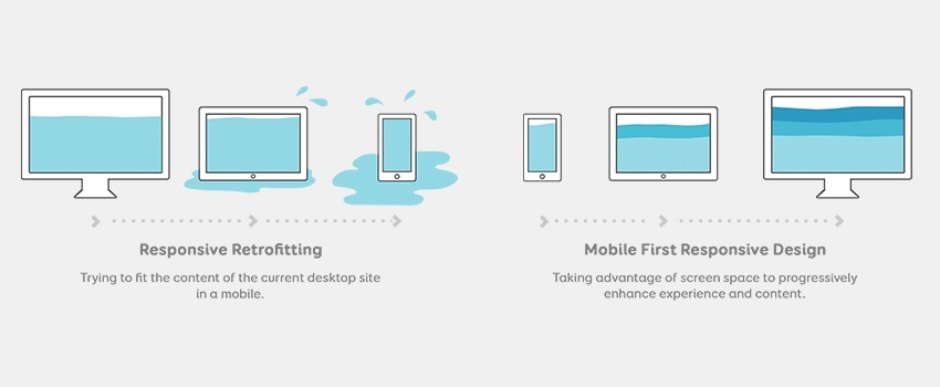
Mobile First Design is a web design concept optimized for mobile. This approach is as follows: Internet pages are first created for smartphones and tablets, and then evolve to fit computers. Until now, it has been quite common for web developers to focus their efforts on creating sites first on desktops. They had at their disposal an immense palette of functions, images and creative possibilities of all kinds for the design of their pages. These were suitable for large screens and a fast Internet connection.
Img Source: – http://bit.ly/2VjBaAT
The mobile pages were at that time relegated to the background or even considered as accessories. The Mobile First strategy disrupts this process and sets new priorities. This affects the form of the technical infrastructure of a website.
The Principle of Mobile First
The Mobile First Design strategy redefines first of all the central aspects of the website and what it offers. It’s not just about content and images, but about the most important features and modules of the page. The basic idea of this strategy is to focus on the essentials by spending less time on programming.
The Mobile First Design Approach In a Few Words:
- Focus on the essentials
- No unnecessary programming
- Maximum performance on all terminals
- Quick access to information
- Adapt the design to Smartphone screens
- No big pictures and useless functions
- Smaller source codes
- Abandoning JavaScript
The development of an optimal solution for mobile is essential. It was only later that computer display is optimized according to the principle of progressive enhancement. This strategy is set up on Smartphone often with the help of typographic grids.
The next step is to extend the page to fit larger screens. The complete display of content on any device registered course is in line with the adaptive website, also called Responsive Design.
Who Pleads for the Mobile First Design Approach?
A large number of mobile users said: Mobile Internet is no longer a niche but an essential market on which all managers must focus. Experts estimate that the global mobile data traffic in 2021 will be 49 Exabyte and will have almost five-fold.
It does not mean that the development of this strategy depends on the expense of traditional formats. But if you want to attract more customers and thus generate more traffic, you must implement the Mobile First strategy.
Focusing on the essentials is by no means a regression from a technological point of view. On the contrary, the structure of the site is lighter, and its format will be more suitable.
In addition, web developers can make their work easier by using CSS pre-processors. These make it possible to modify the parameters such as color and font characters without changing the CSS codes.
Take Advantage of This So-Called Weakness
Mobile Adaptation: The Mobile First strategy takes advantage of this so-called weakness. A small screen obviously implies a smaller display surface. However, instead of losing its substance, the website has the advantage of giving up unnecessary information. Only useful information is display on a screen.
The page can thus adapt to evolving user behavior and set the stage for the success of the Mobile First concept. This strategy is not based on design but new websites in their sets.
The New Usability Criteria
Designing Mobile: The optimized website is a new challenge for web developers, no matter the size of the screen. The mobile user has other requirements that gather around the notion of conviviality of a page.
Also, a search result will not necessarily be the same on a computer and on a Smartphone. The local context of use contributes to this difference. For example, the customer must look for a restaurant’s hours of operation on a phone rather than a computer. The operating system of the Smartphone or tablet also plays a role. Mobile sites should be clear and concise.
What Does “Mobile Friendly” Mean?
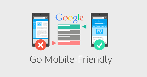
It’s easy for a site administrator to check whether a website is “mobile friendly” or not. He can insert the URL of his page on Google’s compatibility test tool. This tool will show how effectively search engine operates the website.
Img Source: – http://bit.ly/2J5sB64
A page is mobile-friendly if:
- The content is adaptable, readable, easy and quick to understand
- The loading time of the site is fast
- Links are readable and easy to click
A page is not mobile-friendly if:
- The technology used is not suitable (e.g. Flash)
- Typography and font make the content unreadable
- The spaces between the links are too small
- The content is too wide for the screen
Mobile First Strategy Focuses on Content
Beyond the responsive design and technical prerequisites, the content of a site is also very important. Experience has shown that the easier a site is to read, the better it is rated by the Search Engine.
In addition, the emphasis should be on a clear text structure that facilitates reading. Interactive elements such as a good external mesh also play a role. What is clear is that the construction of a mobile internet page prevails over the back-links present on the mobile internet.
The Mobile First strategy does not mean that a website must automatically diminish its content. Texts, images, and drawings remain essential elements to the relevance of a website. Above all, one should properly organize the content to make it adaptable on a small screen. It is, therefore, necessary to organize the text blocks using titles, bold font style to better accompany the reader.
Images and other media can be downloaded quickly while keeping their quality on mobile HD screens.
Is the mobile website an alternative?
The many benefits of the Mobile First approach are unequivocal. Yet few companies can afford to overhaul their websites. Indeed, beyond the scope of designing a web page, the Mobile First strategy requires strong technical means.
To avoid this heavy investment, many decide to make two separate sites. In the long run, all companies will have to rethink their strategies because mobile is now one of the most important modes of communication. His mastery is essential to attract customers.
The mobile Internet will undoubtedly become one of the points of convergence of Internet users looking for information. But the most important thing to remember is that it will soon be the basis of any economic model.
The Mobile First strategy is not always the best for the development of a website. The expensive and dynamic sites have confirmed that the trend is currently developing applications. However, a responsive design remains a concept to keep in mind because mobile users continue to surf websites before installing their applications.
